Blinda's Class
Classwork for BIMM143
Class 5: Data Viz with ggplot
Blinda (PID: A17117043)
Today we are exploring the gggplot package and how to make nice figures in R.
There are lots of ways to make figures and plot in R. These include:
- so called “base”R
- and add on packages like ggplot2
Here is a simple “base” R plot
head(cars)
  speed dist
1     4    2
2     4   10
3     7    4
4     7   22
5     8   16
6     9   10
We can simply pass this to the ‘plot()’ function
plot(cars)
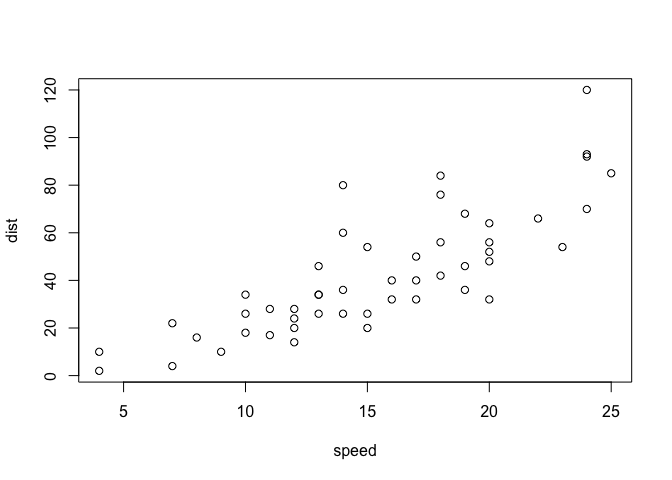
Key-point: Base R is quick but not so nice looking in some folks eyes.
let’s see how we can plot this with ggplot2
1st I need to install this add-on package. For this we use the ‘install.packages()’ function - WE DO THIS IN THE CONSOLE, NOT our report
2nd We need to load the package with the ‘library()’ function every time we want to use it.
library(ggplot2)
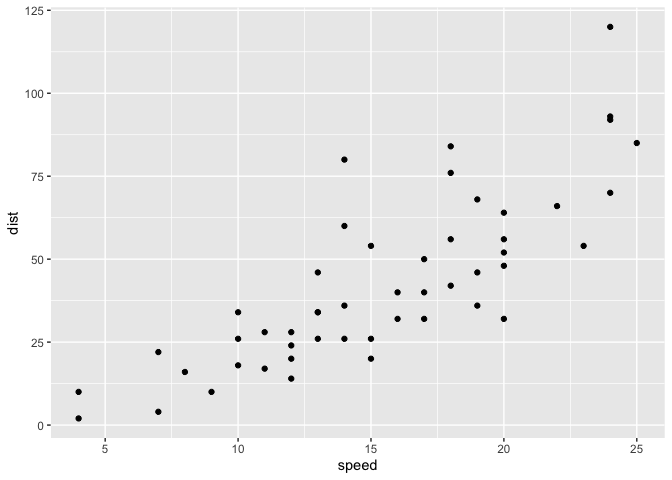
ggplot(cars)

Every ggplot is complosed of at least 3 laryers:
- data (i.e. a data.frame with the things you wnat to plot)
- aesthetics aes() that map the columns of data to your plot features (i.e. aesthetics)
- geoms like gemo_plot() that sort hwo the plot appears
ggplot(cars) +
  aes(x=speed, y=dist) +
  geom_point()
hist(cars$speed)
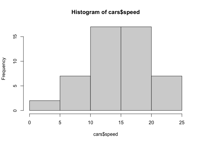
Key point: For simple “canned” graphs base R is quicker and more concise but as things get more custom the elobrate then ggplot wins out…
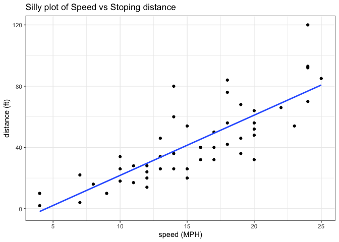
Let’s add more layers to our ggplot
Add a line showing the relationship between x and y Add a title Add custom axis labels “Speed (MPH)” and “Distance (ft)” Change the theme…
ggplot(cars) +
  aes(x=speed, y=dist) +
  geom_point() +
  geom_smooth(method="lm",se=FALSE) +
  labs(title="Silly plot of Speed vs Stoping distance",
       x="speed (MPH)",
       y="distance (ft)" ) +
  theme_bw()
`geom_smooth()` using formula = 'y ~ x'
##Going further
Read some gene expression data
url <- "https://bioboot.github.io/bimm143_S20/class-material/up_down_expression.txt"
genes <- read.delim(url)

head(genes)
        Gene Condition1 Condition2      State
1      A4GNT -3.6808610 -3.4401355 unchanging
2       AAAS  4.5479580  4.3864126 unchanging
3      AASDH  3.7190695  3.4787276 unchanging
4       AATF  5.0784720  5.0151916 unchanging
5       AATK  0.4711421  0.5598642 unchanging
6 AB015752.4 -3.6808610 -3.5921390 unchanging
Q1. How many gnees are in this wee dataset
nrow(genes)
[1] 5196
ncol(genes)
[1] 4
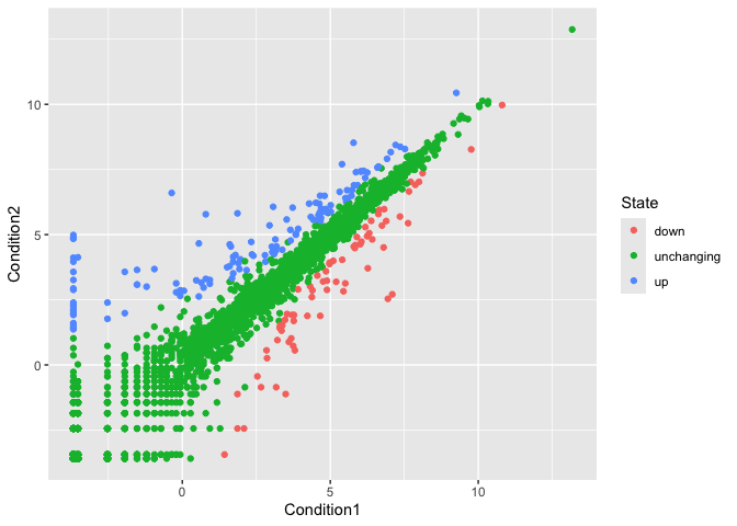
Q2. How many “up” regulated genes are there?
sum(genes$State == "up")
[1] 127
A useful function for counting up occurances of things in a vector is the ‘table()’ function
table(genes$State)
      down unchanging         up
        72       4997        127
fraction
round( table(genes$State)/nrow(genes) * 100, 2 )
      down unchanging         up
      1.39      96.17       2.44
Make a v1 figure
p <-ggplot(genes) +
  aes(x=Condition1,
      y=Condition2,
      col=State) +
  geom_point()

p
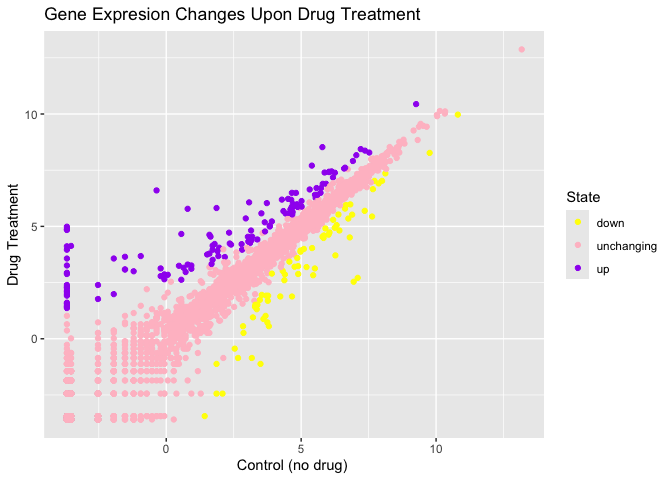
p + scale_colour_manual(values=c("yellow","pink","purple")) +
    labs(title="Gene Expresion Changes Upon Drug Treatment",
         x="Control (no drug) ",
         y="Drug Treatment")
More Plotting
Read gapmider
# File location online
url <- "https://raw.githubusercontent.com/jennybc/gapminder/master/inst/extdata/gapminder.tsv"

gapminder <- read.delim(url)
Lets have a wee peak
head(gapminder,3)
      country continent year lifeExp      pop gdpPercap
1 Afghanistan      Asia 1952  28.801  8425333  779.4453
2 Afghanistan      Asia 1957  30.332  9240934  820.8530
3 Afghanistan      Asia 1962  31.997 10267083  853.1007
Q4. How many different country values are in this dataset?
nrow(gapminder)
[1] 1704
table(gapminder$country)
Afghanistan Albania Algeria
12 12 12
Angola Argentina Australia
12 12 12
Austria Bahrain Bangladesh
12 12 12
Belgium Benin Bolivia
12 12 12
Bosnia and Herzegovina Botswana Brazil
12 12 12
Bulgaria Burkina Faso Burundi
12 12 12
Cambodia Cameroon Canada
12 12 12
Central African Republic Chad Chile
12 12 12
China Colombia Comoros
12 12 12
Congo, Dem. Rep. Congo, Rep. Costa Rica
12 12 12
Cote d'Ivoire Croatia Cuba
12 12 12
Czech Republic Denmark Djibouti
12 12 12
Dominican Republic Ecuador Egypt
12 12 12
El Salvador Equatorial Guinea Eritrea
12 12 12
Ethiopia Finland France
12 12 12
Gabon Gambia Germany
12 12 12
Ghana Greece Guatemala
12 12 12
Guinea Guinea-Bissau Haiti
12 12 12
Honduras Hong Kong, China Hungary
12 12 12
Iceland India Indonesia
12 12 12
Iran Iraq Ireland
12 12 12
Israel Italy Jamaica
12 12 12
Japan Jordan Kenya
12 12 12
Korea, Dem. Rep. Korea, Rep. Kuwait
12 12 12
Lebanon Lesotho Liberia
12 12 12
Libya Madagascar Malawi
12 12 12
Malaysia Mali Mauritania
12 12 12
Mauritius Mexico Mongolia
12 12 12
Montenegro Morocco Mozambique
12 12 12
Myanmar Namibia Nepal
12 12 12
Netherlands New Zealand Nicaragua
12 12 12
Niger Nigeria Norway
12 12 12
Oman Pakistan Panama
12 12 12
Paraguay Peru Philippines
12 12 12
Poland Portugal Puerto Rico
12 12 12
Reunion Romania Rwanda
12 12 12
Sao Tome and Principe Saudi Arabia Senegal
12 12 12
Serbia Sierra Leone Singapore
12 12 12
Slovak Republic Slovenia Somalia
12 12 12
South Africa Spain Sri Lanka
12 12 12
Sudan Swaziland Sweden
12 12 12
Switzerland Syria Taiwan
12 12 12
Tanzania Thailand Togo
12 12 12
Trinidad and Tobago Tunisia Turkey
12 12 12
Uganda United Kingdom United States
12 12 12
Uruguay Venezuela Vietnam
12 12 12
West Bank and Gaza Yemen, Rep. Zambia
12 12 12
Zimbabwe
12
length(table(gapminder$country))
[1] 142
Q5.How many different continent values are in this dataset.
unique(gapminder$continent)
[1] "Asia" "Europe" "Africa" "Americas" "Oceania"
ggplot(gapminder) +
  aes(gdpPercap, lifeExp, col=continent, label=country) +
  geom_point() +
  geom_text()
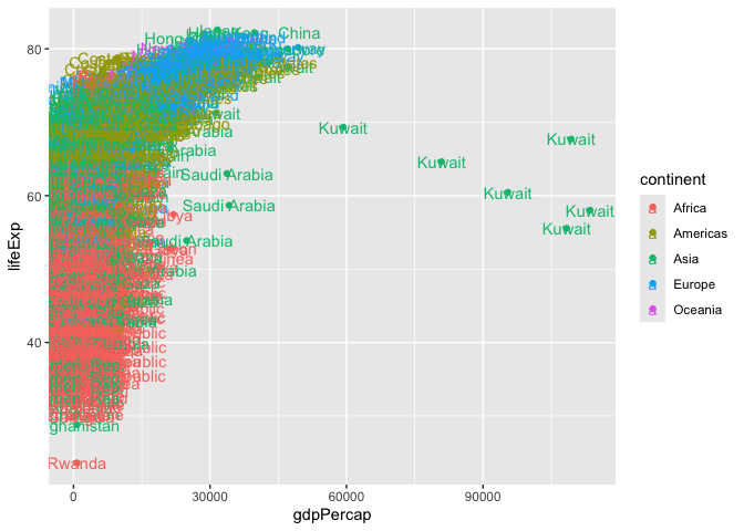
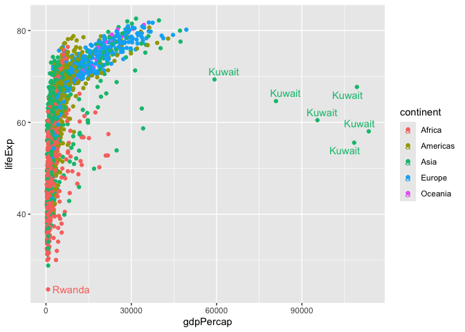
I can use ggrepl package to make more sensible labels here.
library(ggrepel)

ggplot(gapminder) +
  aes(gdpPercap, lifeExp, col=continent, label=country) +
  geom_point() +
  geom_text_repel()
Warning: ggrepel: 1697 unlabeled data points (too many overlaps). Consider
increasing max.overlaps
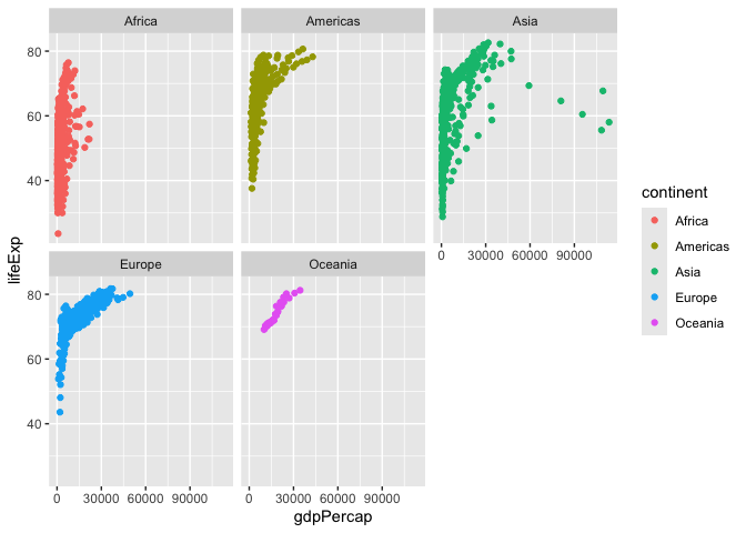
I want a seperate a pnnel per continent
ggplot(gapminder) +
  aes(gdpPercap, lifeExp, col=continent, label=country) +
  geom_point() +
  facet_wrap(~continent)
##Summary
The main advantages of ggplot over base R plotting are:
Let’s focus on the main advantages of ggplot2 over base R plotting:
-
ggplot2 uses a layered approach (data, aesthetics, geometry), making it easier to build complex, publication-quality plots by adding layers step by step. Base R requires different functions and many arguments for each plot type, which can be fiddly and time-consuming to refine for publication-quality figures.
-
ggplot2 provides sensible defaults for aesthetics and themes, so plots look visually appealing with less manual tweaking. Base R gives full control but often needs more effort to polish.
-
ggplot2 code is more concise for complex plots, while base R is quicker for simple, exploratory plots but gets verbose and complicated for advanced visualizations.
-
ggplot2 makes it easier to automate and reproduce plots, especially for reports, since the same code structure applies to different datasets and plot types.