Blinda's Class
Classwork for BIMM143
Lab 12 DESeq Lab
Blinda Sui (PID: A17117043)
- Background
- Data import
- Toy differential gene expression
- DESeq2 analysis
- Volcano Plot
- Save our results
Background
Today we will analyze some RNASeq data from Himes et al.on the effects of a common steroid (dexamethasone) on airway smooth muscle cells (ASM cells)
Are starting point is the “counts” data and “metadata” that contain the count values for each gene in their different experiments (i.e. cell lines with or without the drug)
Data import
#Complete the missing code
counts <- read.csv("airway_scaledcounts.csv", row.names=1)
metadata <- read.csv("airway_metadata.csv")
head(counts)
                SRR1039508 SRR1039509 SRR1039512 SRR1039513 SRR1039516
ENSG00000000003        723        486        904        445       1170
ENSG00000000005          0          0          0          0          0
ENSG00000000419        467        523        616        371        582
ENSG00000000457        347        258        364        237        318
ENSG00000000460         96         81         73         66        118
ENSG00000000938          0          0          1          0          2
                SRR1039517 SRR1039520 SRR1039521
ENSG00000000003       1097        806        604
ENSG00000000005          0          0          0
ENSG00000000419        781        417        509
ENSG00000000457        447        330        324
ENSG00000000460         94        102         74
ENSG00000000938          0          0          0
Q1. How many genes are in this dataset?
nrow(counts)
[1] 38694
Q. How many different experiments (columns in counts or rows in metadata) are there?
nrow(metadata)
[1] 8
Q2. How many ‘control’ cell lines do we have?
sum(metadata$dex == "control")
[1] 4
Toy differential gene expression
To start our analysis let’s calculate the mean counts for all genes in the “control” experiments.
- Extract all “control” columns from the
countsobject. - Calculate the mean for all rows (i.e. gnes) of these “control” columns. 3-4. Do the same for “treated”.
- Compare these
control.meanandtreated.meanvalues.
#1
control.inds <- metadata$dex == "control"
control.counts <- counts[,control.inds]
Q3. How would you make the above code in either approach more robust? Is there a function that could help here?
rowMean()
Q4. Follow the same procedure for the treated samples (i.e. calculate the mean per gene across drug treated samples and assign to a labeled vector called treated.mean)
#2
control.means <- rowMeans(control.counts)

#3-4
treated.means <- rowMeans(counts[, metadata$dex == "treated"])
Store these together for case of bookkeeping as meancounts
#5
meancounts <- data.frame(control.means, treated.means)
head(meancounts)
                control.means treated.means
ENSG00000000003        900.75        658.00
ENSG00000000005          0.00          0.00
ENSG00000000419        520.50        546.00
ENSG00000000457        339.75        316.50
ENSG00000000460         97.25         78.75
ENSG00000000938          0.75          0.00
Make a plot of control vs treated mean values ofr all genes
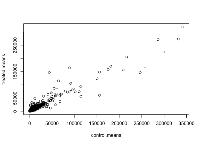
Q5 (a). Create a scatter plot showing the mean of the treated samples against the mean of the control samples. Your plot should look something like the following.
plot(meancounts)
plot(meancounts, log="xy")
Warning in xy.coords(x, y, xlabel, ylabel, log): 15032 x values <= 0 omitted
from logarithmic plot

Warning in xy.coords(x, y, xlabel, ylabel, log): 15281 y values <= 0 omitted
from logarithmic plot

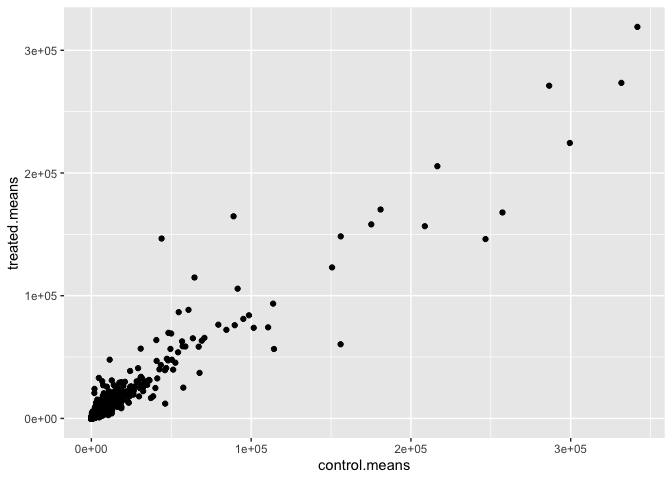
Q5 (b).You could also use the ggplot2 package to make this figure producing the plot below. What geom_?() function would you use for this plot?
library(tidyverse)
── Attaching core tidyverse packages ──────────────────────── tidyverse 2.0.0 ──
✔ dplyr     1.1.4     ✔ readr     2.1.5
✔ forcats   1.0.1     ✔ stringr   1.5.2
✔ ggplot2   4.0.0     ✔ tibble    3.3.0
✔ lubridate 1.9.4     ✔ tidyr     1.3.1
✔ purrr     1.1.0
── Conflicts ────────────────────────────────────────── tidyverse_conflicts() ──
✖ dplyr::filter() masks stats::filter()
✖ dplyr::lag()    masks stats::lag()
ℹ Use the conflicted package (<http://conflicted.r-lib.org/>) to force all conflicts to become errors
ggplot(meancounts, aes(x = control.means, y = treated.means)) +
  geom_point()
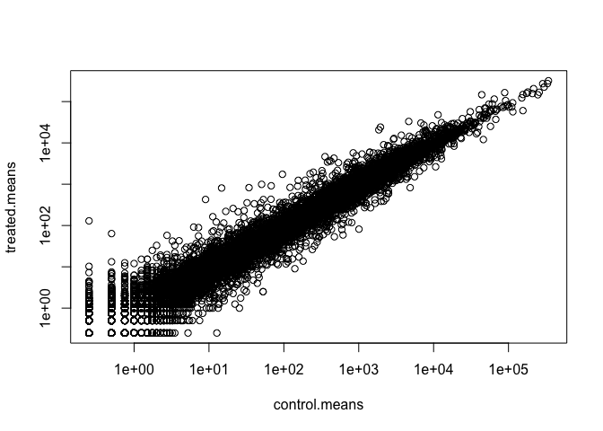
Q6. Try plotting both axes on a log scale. What is the argument to plot() that allows you to do this?
plot(control.means, treated.means, log = "xy")
Warning in xy.coords(x, y, xlabel, ylabel, log): 15032 x values <= 0 omitted
from logarithmic plot

Warning in xy.coords(x, y, xlabel, ylabel, log): 15281 y values <= 0 omitted
from logarithmic plot
Q7. What is the purpose of the arr.ind argument in the which() function call above? Why would we then take the first column of the output and need to call the unique() function?
The arr.ind=TRUE argument will clause which() to return both the row and column indices (i.e. positions) where there are TRUE values. In this case this will tell us which genes (rows) and samples (columns) have zero counts. We are going to ignore any genes that have zero counts in any sample so we just focus on the row answer. Calling unique() will ensure we don’t count any row twice if it has zero entries in both samples.
We often talk metrics like “log2 fold-change”
# treated/control
log2(10/10)
[1] 0
log2(10/20)
[1] -1
log2(20/10)
[1] 1
log2(40/10)
[1] 2
log2(10/40)
[1] -2
Let’s calculate the log2 fold change for our treated over control mean counts.
meancounts$log2fc <- log2(meancounts$treated.means/
   meancounts$control.means)
head(meancounts)
                control.means treated.means      log2fc
ENSG00000000003        900.75        658.00 -0.45303916
ENSG00000000005          0.00          0.00         NaN
ENSG00000000419        520.50        546.00  0.06900279
ENSG00000000457        339.75        316.50 -0.10226805
ENSG00000000460         97.25         78.75 -0.30441833
ENSG00000000938          0.75          0.00        -Inf
A common “rule of thumb” is a log2 fold change cutoff +2 and -2 to call genes “Up regulated” or “Down regulated”.
sum(meancounts$log2fc >= +2, na.rm=T)
[1] 1910
#When na.rm is set to TRUE, the function will remove or ignore any NA values present in the input data before performing the calculation. If na.rm is set to FALSE (which is often the default), and there are NA values in the data, the function will typically return NA as the result, as it cannot compute a meaningful value when missing data is present.
Number of “down” genes at -2 threshold
sum(meancounts$log2fc <= -2, na.rm=T)
[1] 2330
Q8. Using the up.ind vector above can you determine how many up regulated genes we have at the greater than 2 fc level?
Q9. Using the down.ind vector above can you determine how many down regulated genes we have at the greater than 2 fc level?
up.ind <- meancounts$log2fc > 2
down.ind <- meancounts$log2fc < (-2)
sum(up.ind, na.rm=T)
[1] 1846
sum(down.ind, na.rm=T)
[1] 2212
Q10. Do you trust these results? Why or why not?
This fold change is not enough to determin the significance, so I do not trust thesed results.
DESeq2 analysis
Let’s do this analysis properly and keep our inner stats nerd happy - i.e. are the differences we see between drug and no drug significant given the replicate experiments.
library(DESeq2)
For DESeq analysis we need three things
- count values (
contdata) - metadata telling us about the columns in
countData(colData) - design of the experiment (i.e. what do you want to compare)
Our first function form DESeq2 will setup the input required for analysis by storing all these 3 things together.
dds <- DESeqDataSetFromMatrix(countData = counts,
                              colData = metadata,
                              design = ~dex)
converting counts to integer mode

Warning in DESeqDataSet(se, design = design, ignoreRank): some variables in
design formula are characters, converting to factors
The main function in DESeq2 that runs the analysis is called DESeq()
dds <- DESeq(dds)
estimating size factors

estimating dispersions

gene-wise dispersion estimates

mean-dispersion relationship

final dispersion estimates

fitting model and testing
res <- results(dds)
head(res)
log2 fold change (MLE): dex treated vs control
Wald test p-value: dex treated vs control
DataFrame with 6 rows and 6 columns
                  baseMean log2FoldChange     lfcSE      stat    pvalue
                 <numeric>      <numeric> <numeric> <numeric> <numeric>
ENSG00000000003 747.194195      -0.350703  0.168242 -2.084514 0.0371134
ENSG00000000005   0.000000             NA        NA        NA        NA
ENSG00000000419 520.134160       0.206107  0.101042  2.039828 0.0413675
ENSG00000000457 322.664844       0.024527  0.145134  0.168996 0.8658000
ENSG00000000460  87.682625      -0.147143  0.256995 -0.572550 0.5669497
ENSG00000000938   0.319167      -1.732289  3.493601 -0.495846 0.6200029
                     padj
                <numeric>
ENSG00000000003  0.163017
ENSG00000000005        NA
ENSG00000000419  0.175937
ENSG00000000457  0.961682
ENSG00000000460  0.815805
ENSG00000000938        NA
36000 * 0.05
[1] 1800
Volcano Plot
This is a common summary result figure from these types of experiments and plot the log2 fold-change vs the adjusted p-value
plot(res$log2FoldChange, -log(res$padj))
abline(v=c(-2,2), col="red")
abline(h=-log(0.04), col="red")
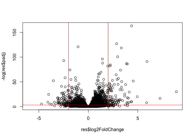
#abline() function in R is used to add one or more straight lines to an existing plot. It is a powerful tool for enhancing data visualization by highlighting trends, relationships, or specific reference points within your data.
Save our results
write.csv(res, file="my_results.csv")